Luxury Wall Art: How to Make Any Room Look Expensive
The Heva Team
Art Curators & Interior Design Enthusiasts · February 26, 2026 · 14 min read
Discover how the right luxury wall art can make any room look expensive without the designer price tag.
You do not need a six-figure renovation budget to make a room look like it belongs in an architecture magazine. The secret that professional stagers and interior designers rely on is remarkably simple: the right piece of wall art, hung at the right height, in the right scale, transforms a room from ordinary to aspirational in under an hour. In fact, a 2025 report by IPMM found that curated artwork is one of the top elements luxury real estate agents use to increase perceived property value. This guide walks you through the principles that make wall art look expensive, the styles that deliver the strongest visual impact, and six specific pieces you can hang today to elevate any room in your home.
Ready to browse? Explore our full luxury wall art collection, or keep reading for our top picks and expert tips.
What You Will Find in This Guide
- What Makes Wall Art Look Expensive
- Gold Leaf and Metallic Tones: The Fastest Route to Luxury
- Gallery-Style Spacing and Placement
- Our 6 Luxury Wall Art Picks
- Luxury Styling Tips with Real Measurements
- 5 Common Mistakes That Make Art Look Cheap
- Frequently Asked Questions
- Quick Reference Table
What Makes Wall Art Look Expensive: Scale, Framing, and Colour
Three elements separate a piece of wall art that looks like an afterthought from one that looks like a deliberate design choice: scale, framing, and colour harmony. Understanding these three principles will change how you shop for art forever.
Scale: Go Bigger Than You Think
The single most common mistake in home decor is choosing art that is too small for the wall. Interior designers consistently recommend that wall art should cover 57 to 75 percent of the available wall width above a piece of furniture. For a sofa that measures 200 cm (79 inches) wide, that means your art should be at least 114 cm (45 inches) wide. A small 30 cm (12 inch) print above a king-size bed will always look like an afterthought, no matter how beautiful the image. When in doubt, go one size larger than your instinct tells you. If you want detailed guidance on choosing the right dimensions, our wall art size guide breaks it down room by room.
Framing: The Invisible Upgrade
A quality frame acts as a visual border between your art and the wall, giving the piece architectural weight. Matte black frames on canvas prints deliver a clean, gallery-grade look that works with virtually every interior style from Scandinavian minimalism to Art Deco maximalism. The depth of a framed canvas, typically 3 to 4 cm (about 1.5 inches), casts a subtle shadow that makes the piece feel three-dimensional and intentional. Unframed posters pinned to walls, by contrast, signal temporary living rather than curated design.
Colour Harmony: Match Without Matching
Luxury interiors use a technique called "colour echoing," where two or three tones from the art reappear somewhere else in the room, in a throw pillow, a vase, or a rug. This does not mean the art should match your sofa exactly; rather, it should share a colour temperature. A research paper published in Frontiers in Psychology (2020) found that spatial colour combinations perceived as high luxury significantly increased both pleasure responses and preference to stay in a space. Warm metallics like gold, amber, and bronze are universally read as expensive, which is why they appear in virtually every five-star hotel lobby on earth. For deeper insights into how colour choices affect the feel of your room, read our colour psychology guide.
Gold Leaf and Metallic Tones: The Fastest Route to Luxury
There is a reason gold has symbolised wealth across every culture for millennia. In interior design, even a single gold-toned accent in a room raises the perceived value of the entire space. Gold works because it catches light and redistributes it, adding warmth and dimension to flat walls. The key is restraint. A single canvas print with gold accents against a rich background, for instance a black-and-gold botanical or a gold-flecked abstract, delivers high impact without tipping into excess. Pair gold wall art with matte surfaces like linen upholstery, natural wood, or brushed concrete for a contrast that feels modern rather than ornate.
When selecting gold-toned art, look for pieces where the gold appears as a design element rather than a colour filter. Art that simulates gold leaf, metallic ink, or gilded texture photographs far more convincingly than a flat gold-coloured print. Every piece in our collection below features genuine metallic-style rendering that catches light and shifts appearance depending on your room's lighting angle.
Gallery-Style Spacing and Placement
Professional galleries hang artwork so that the centre of the piece sits at 145 cm (57 inches) from the floor, which corresponds to the average human eye level. This standard, used by museums worldwide, ensures the viewer looks directly into the art rather than up or down at it. When hanging art above furniture, leave a gap of 15 to 20 cm (6 to 8 inches) between the top of the sofa or console and the bottom edge of the frame. Too much gap, and the art floats disconnected from the furniture below; too little, and it feels crowded.
For a gallery-wall arrangement with multiple pieces, maintain consistent spacing of 5 to 8 cm (2 to 3 inches) between frames. A single oversized piece, however, often reads as more expensive than a collection of smaller works, because it signals confidence and intention. If you want a step-by-step guide to building a gallery wall, our gallery wall layout guide covers every detail.
Our 6 Luxury Wall Art Picks
1. Geometric Texture Panels in Walnut and Gold
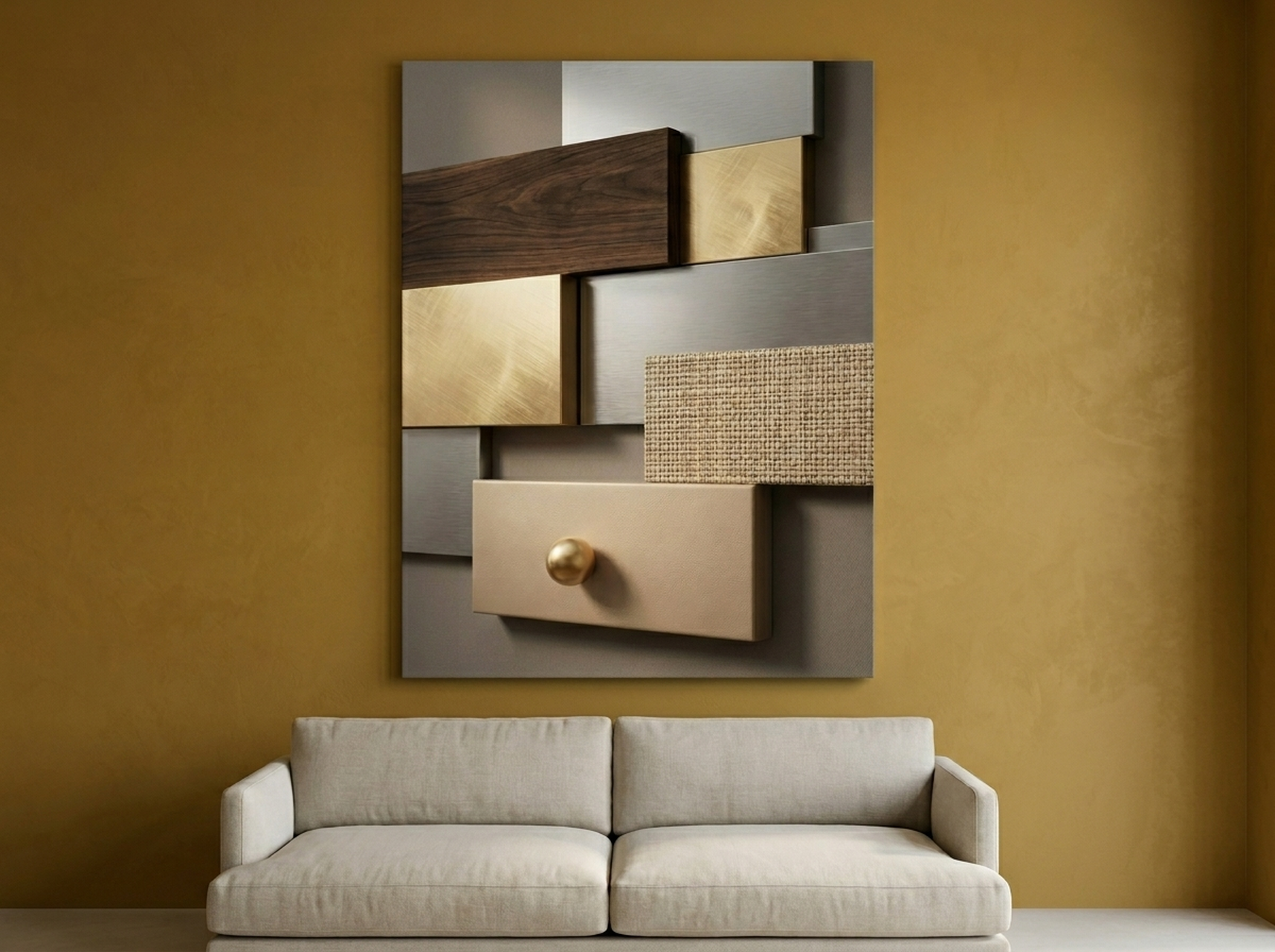
This piece works because it bridges the gap between abstract art and architectural detail. The layered walnut-brown panels with gold accent lines create a textured, dimensional appearance that mimics high-end bas-relief wall sculpture. Hang it in a living room above a dark leather sofa or in a hallway where you want a strong first impression. The earthy palette plays well with mid-century modern furniture, warm wood floors, and brass hardware. At 61 by 91 cm (24 by 36 inches) on our largest option, it anchors a wall without overwhelming the space.
View the Geometric Texture Panels
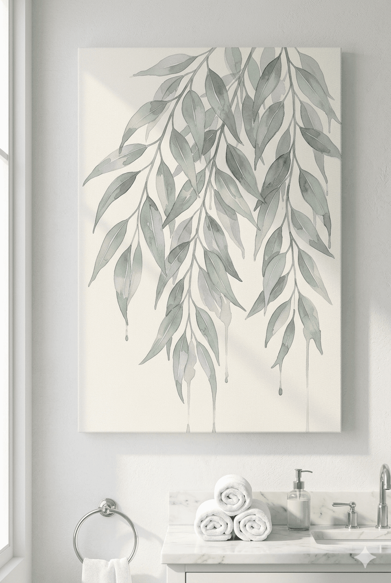
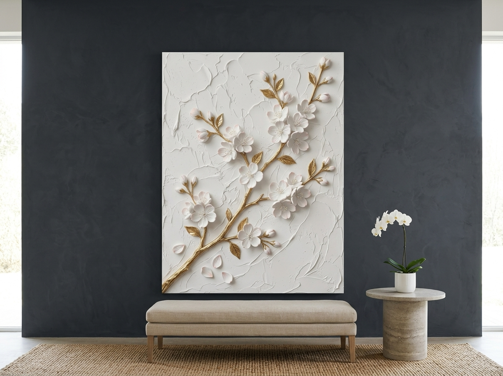
2. Cherry Blossom Sculptural Relief in White and Gold
If your room leans toward light neutrals, creams, or soft whites, this cherry blossom piece adds luxury without disrupting the calm palette. The sculptural relief effect makes the blossoms appear to lift off the canvas, and the gold-touched petals catch ambient light beautifully. It is an ideal choice for a bedroom above a tufted headboard, a spa-inspired bathroom, or a quiet reading nook. The white-and-gold combination is one of the most universally flattering pairings in interior design, working equally well against warm ivory walls and cool grey tones.
View the Cherry Blossom Relief
3. Gold Leaf Lotus Flower on Black
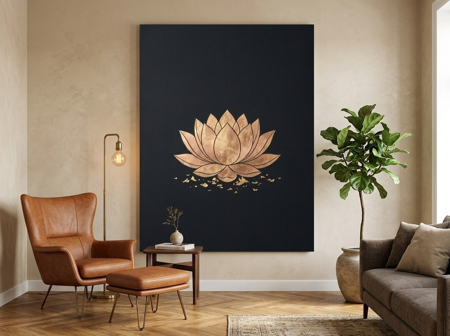
High contrast is the hallmark of confident design, and this black-and-gold lotus delivers it in spades. The gold leaf rendering against a deep black background creates a jewel-box effect that draws the eye immediately. This is the piece you hang on a feature wall in a dining room, above a bar cart, or as the focal point of a dark-walled study. The lotus motif carries associations with purity, renewal, and resilience, adding narrative depth alongside visual impact. Pair it with black matte frames on neighbouring shelves and a single brass table lamp for a coordinated, luxurious vignette.
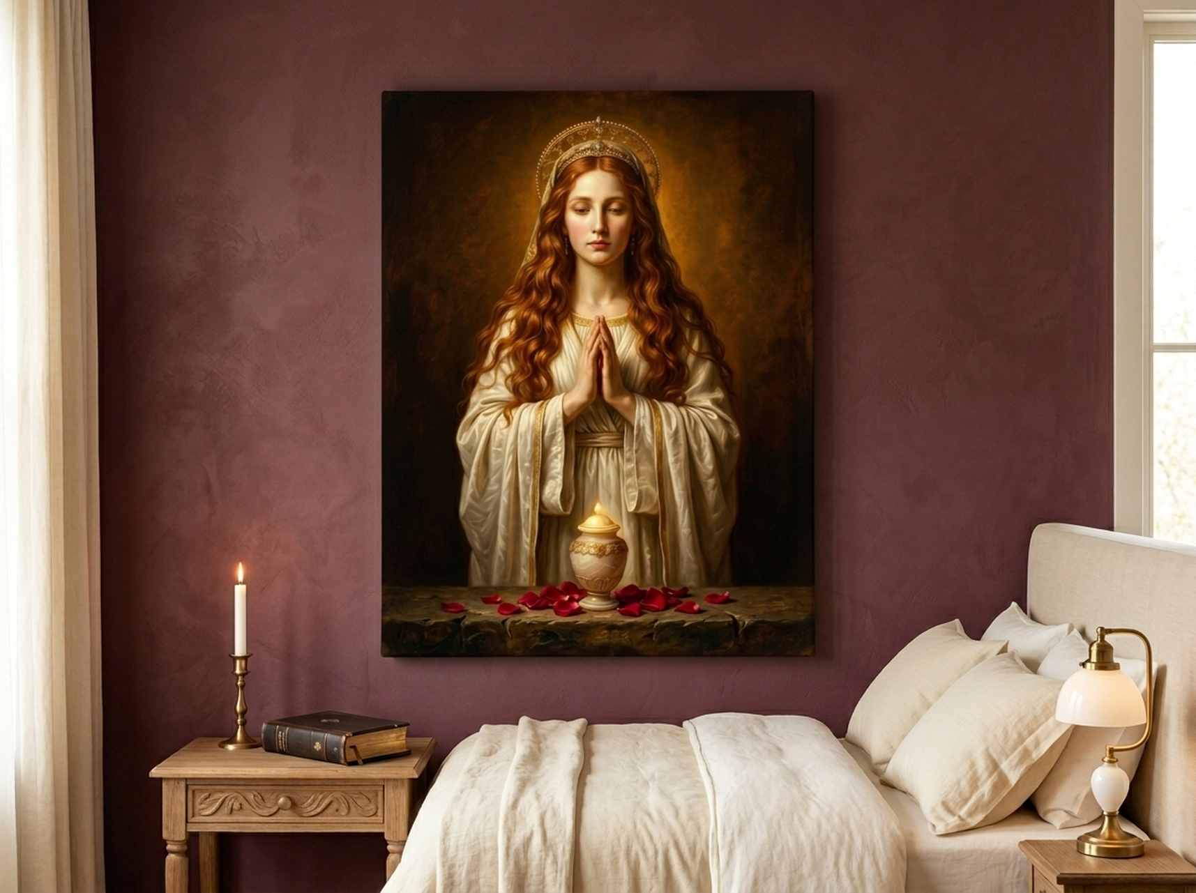
4. Mary Magdalene Renaissance Portrait
Nothing communicates old-world sophistication quite like Renaissance portraiture. This Mary Magdalene piece recreates the depth and warmth of a museum oil painting, with rich burgundy, deep umber, and glowing highlight tones that give it genuine gravitas. Hang it in a formal living room, a library corner, or a dining room where conversation and contemplation meet. The portrait style works especially well in rooms with traditional or transitional furniture, but it also creates a striking contrast in a modern, minimal space where it becomes the sole decorative statement. At the largest size option, it delivers the presence of a gallery-level original at a fraction of the cost.
View the Mary Magdalene Portrait
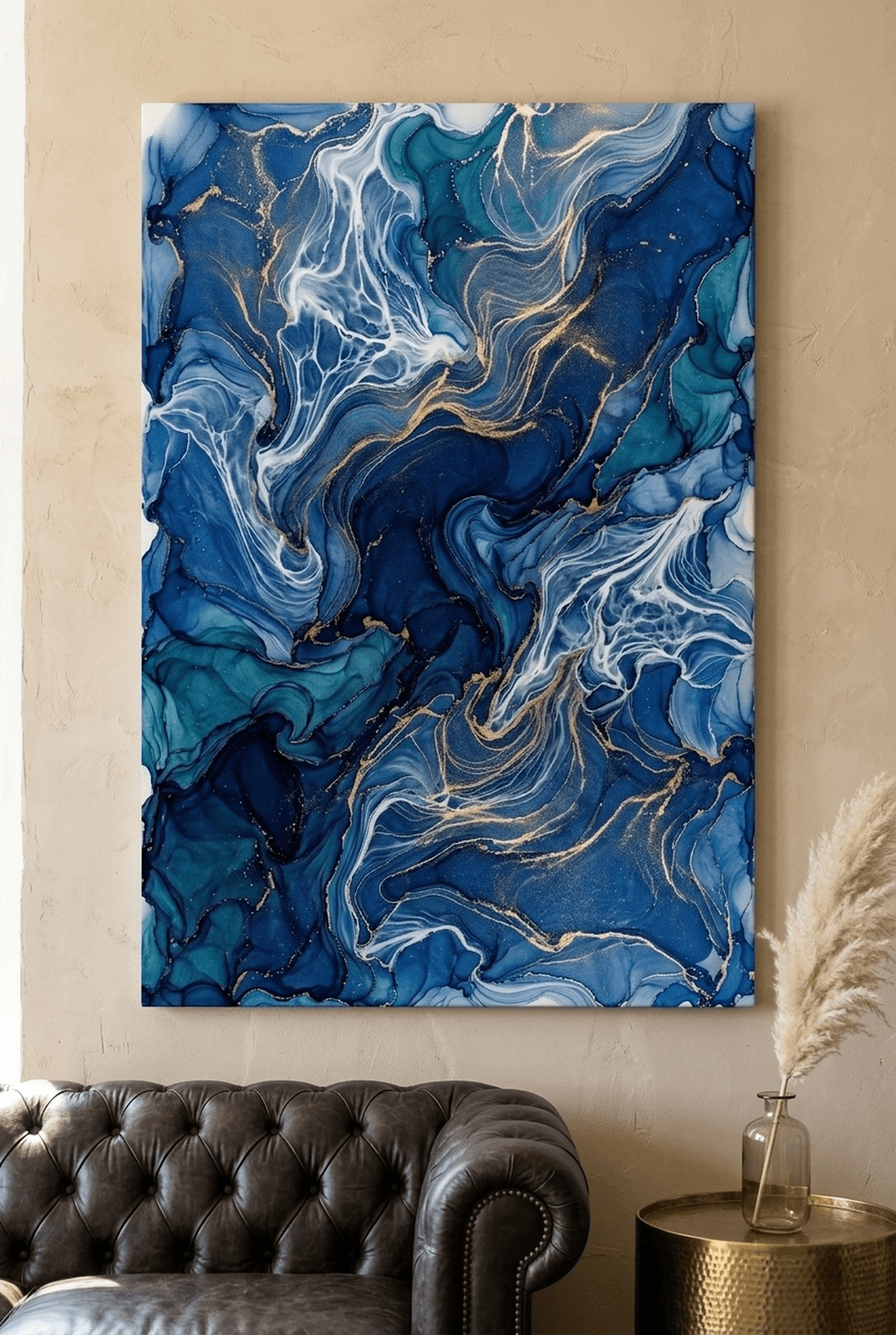
5. Fluid Abstract Landscape in Gold and Amber
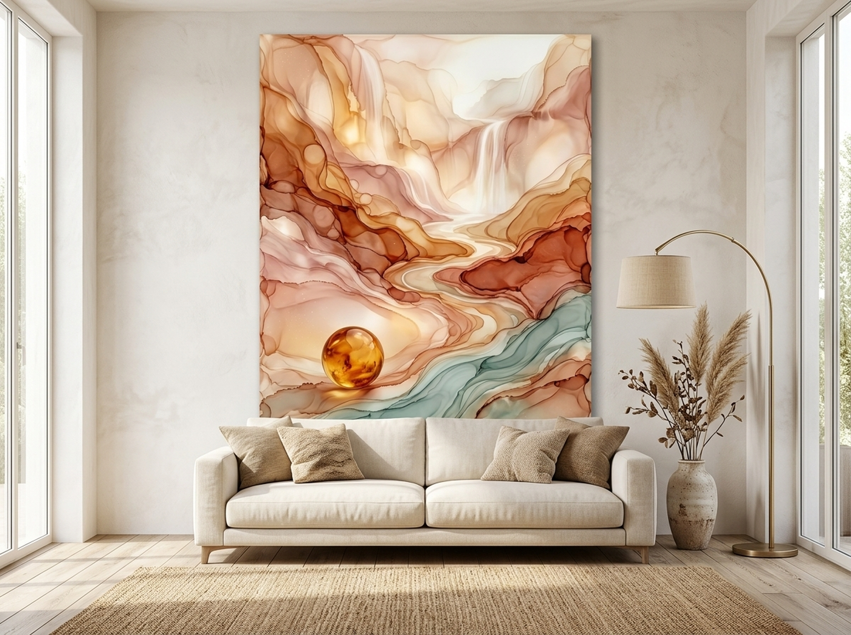
Abstract art is the interior designer's go-to for luxury spaces because it adds visual interest without competing with other decor elements. This fluid landscape in gold and amber tones mimics the look of marbled resin or poured acrylics, creating an organic, flowing composition that feels both natural and refined. The warm amber palette makes it a natural fit for living rooms, bedrooms, and open-plan dining areas where you want a sense of warmth and movement. It pairs beautifully with cream sofas, natural stone surfaces, and warm wood tones. Because abstract art does not depict a specific subject, it works in virtually any room without clashing with existing themes or decor styles.
View the Fluid Abstract Landscape
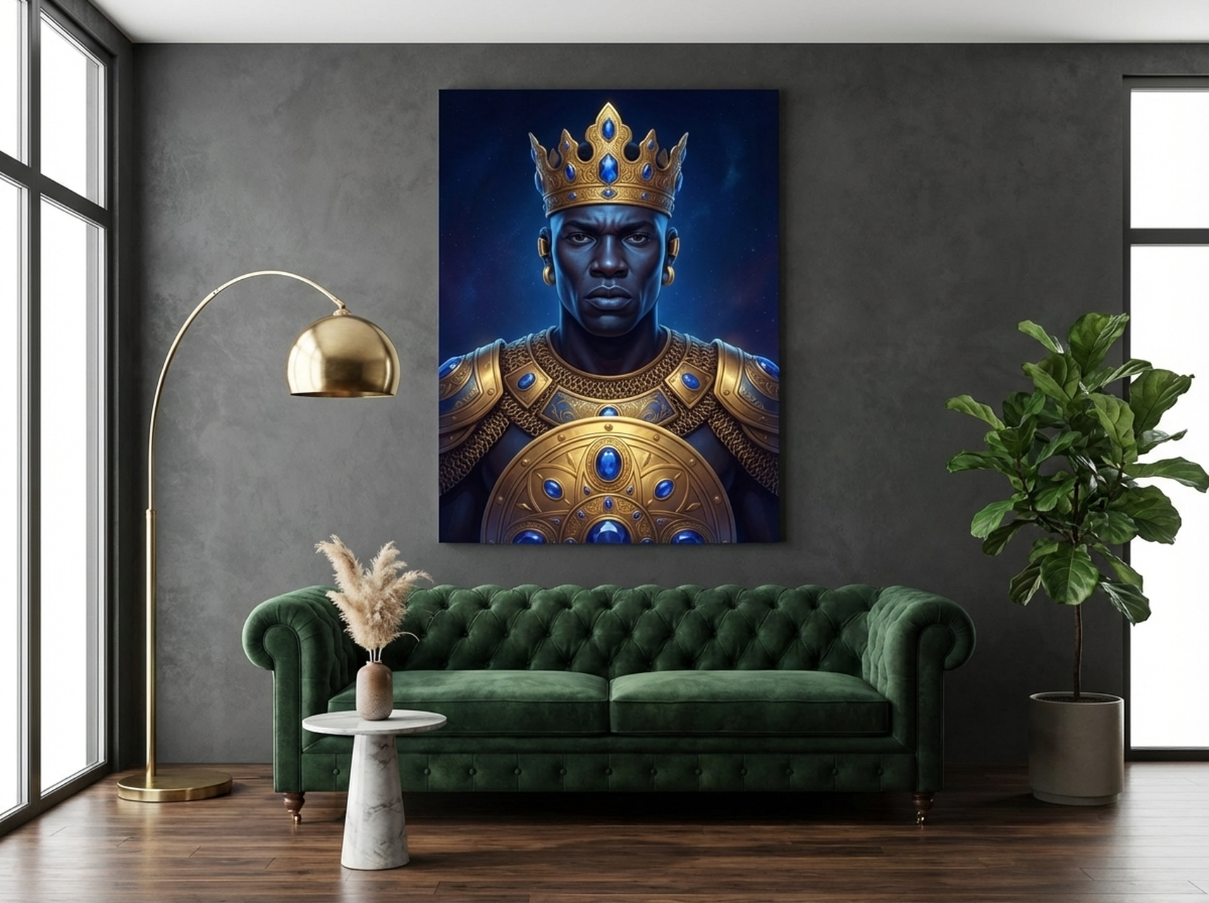
6. African Warrior King in Gold Armor
Statement art is luxury art, and this gold-armored warrior king is the definition of a statement piece. The intricate gold detailing across the armor, combined with the deep, saturated background, gives this print the weight and presence of a commissioned oil painting. It is particularly striking in rooms with dark accent walls, rich jewel-toned upholstery, or Afrohemian design elements. Hang it as a solo centrepiece in a living room or entryway where it can command attention from across the room. The gold tones tie effortlessly into brass light fixtures, gold-framed mirrors, and metallic accent decor. For more on this design direction, explore our African wall art heritage guide.
Luxury Styling Tips with Real Measurements
Knowing what to buy is only half the equation. How you style and place your art makes the difference between a room that looks designed and a room that looks decorated. Here are the specific measurements and techniques professionals use.
The 57-Inch Rule
Hang the centre of your artwork at 145 cm (57 inches) from the floor. This is the museum standard and it works in every room. Measure from the floor to the centre of the frame, not the hook or wire on the back. If you are hanging above a sofa, prioritise the 15 to 20 cm (6 to 8 inch) gap between furniture and frame, even if it means the centre sits slightly higher than 145 cm.
The Two-Thirds Rule
Your art should be approximately two-thirds the width of the furniture beneath it. A console table that measures 120 cm (47 inches) wide calls for art that is roughly 80 cm (31 inches) wide. This ratio creates visual balance and prevents the art from looking either lost or overbearing relative to the furniture.
Lighting Makes Everything Look More Expensive
A single picture light mounted 15 to 20 cm (6 to 8 inches) above the frame, angled at 30 degrees, transforms any canvas into a museum-grade focal point. LED picture lights in warm white (2700K to 3000K) add warmth without yellowing the art. If you cannot install a hardwired picture light, battery-operated versions with adhesive mounts deliver a surprisingly similar effect and require no electrical work.
The White Space Strategy
Luxury interiors use negative space as a design element. Resist the urge to fill every wall. A single large canvas on one wall, with the adjacent walls left intentionally bare, communicates confidence and restraint, two qualities that always read as expensive. This is especially effective in hallways, entryways, and above fireplaces where a single piece has room to breathe.
5 Common Mistakes That Make Wall Art Look Cheap
1. Hanging Art Too High
When art is hung at the top third of the wall instead of eye level, it creates an awkward visual gap between the furniture and the art. The room feels disconnected and the art looks like it is floating away from the living space. Always measure to 145 cm (57 inches) at centre.
2. Choosing Art That Is Too Small
A 20 by 30 cm (8 by 12 inch) print above a 240 cm (94 inch) sofa will always look like an afterthought. Scale is the single biggest factor in whether art reads as intentional or accidental. If your budget limits the size, one large piece will always look more expensive than a scattered collection of small, unrelated prints.
3. Mismatched Frames in a Group
A gallery wall with five different frame styles, colours, and materials looks like a thrift store haul, not a curated collection. For a luxury look, use identical frames throughout the grouping. If you want variety, vary the art inside the frames while keeping the frame finish, width, and colour consistent.
4. Ignoring Wall Colour When Choosing Art
A pale watercolour on a white wall disappears. A dark oil painting on a dark wall turns into a shadow. Luxury designers select art that creates contrast with the wall behind it. Gold-toned art on a deep navy or charcoal wall is one of the most reliable high-impact combinations in interior design.
5. Using Low-Resolution Prints
Pixelated, blurry prints betray their low quality immediately. Every piece in our collection is printed at 300 DPI on premium matte canvas with archival inks, ensuring crisp detail and accurate colour reproduction that holds up to close inspection. The quality of the print surface is what separates wall art that looks like a poster from wall art that looks like an original painting.
Frequently Asked Questions About Luxury Wall Art
What style of wall art looks the most expensive?
Large-scale abstract art with metallic tones, Renaissance-style portraits, and sculptural relief prints consistently read as the most expensive styles. The common thread is that they feature visible texture, rich colour depth, and a sense of craft. A single oversized canvas in a black frame will nearly always look more luxurious than a cluster of small, unframed prints.
Does wall art actually affect how expensive a room feels?
Yes. Art is one of the first elements the eye registers when entering a room. Professional stagers consistently rank wall art among the top three elements, alongside lighting and textiles, that determine whether a room feels budget or premium. The combination of scale, colour, and framing quality creates an immediate impression that influences how visitors perceive the entire space.
What colours make wall art look luxurious?
Gold, black, deep navy, burgundy, emerald, and warm amber consistently test as the most luxurious colour palettes. Gold tones in particular carry cross-cultural associations with wealth and status. Avoid overly bright primary colours (bright red, neon green, electric blue) in rooms where you want a refined, upscale feel, unless they appear as subtle accents within a larger, muted composition.
Is canvas or paper better for luxury wall art?
Canvas. Stretched canvas has a visible weave texture that catches light and adds physical depth to the print. Paper prints lie flat behind glass, which can produce glare and feels less substantial. Framed canvas prints combine the textural richness of canvas with the architectural weight of a frame, which is why they are the default choice for luxury hotels, restaurants, and high-end residential projects.
How big should luxury wall art be?
For a living room feature wall, aim for at least 60 by 90 cm (24 by 36 inches) as a minimum. Above a sofa, the art width should be 57 to 75 percent of the sofa width. In a dining room or hallway, a single piece that spans at least half the wall width creates the strongest impression. When choosing between two sizes, always go larger; oversized art is a hallmark of professionally designed spaces.
Can I mix luxury art styles in the same room?
You can, but with discipline. Stick to a unified colour temperature (all warm or all cool) and vary the subject matter rather than the colour palette. For example, a gold-and-black abstract on one wall paired with a gold-toned portrait on the opposite wall creates variety without visual conflict. Avoid mixing more than two distinct styles in one room.
Quick Reference Table
| Product | Best For | Dominant Colours | Link |
|---|---|---|---|
| Geometric Texture Panels | Living rooms, hallways, mid-century interiors | Walnut brown, gold, cream | View |
| Cherry Blossom Relief | Bedrooms, bathrooms, light neutral rooms | White, gold, soft pink | View |
| Gold Leaf Lotus | Dining rooms, studies, dark accent walls | Black, gold | View |
| Mary Magdalene Portrait | Formal living rooms, libraries, dining rooms | Burgundy, umber, warm gold | View |
| Fluid Abstract Landscape | Open-plan living, bedrooms, warm interiors | Gold, amber, cream | View |
| African Warrior King | Feature walls, entryways, Afrohemian spaces | Gold, black, deep brown | View |
Elevate Your Space Today
Luxury is not about how much you spend; it is about how intentionally you choose. A single well-scaled, beautifully framed canvas print in the right colour palette will do more for your room than a dozen scattered accessories. Every piece in this guide is printed on premium matte canvas, framed in gallery-grade black, and ready to hang the day it arrives. Choose the piece that speaks to you, hang it at 145 cm centre, add a picture light, and watch your room transform.