Psychology of Colors in Wall Art for Every Room
The Heva Team
Art Curators & Interior Design Enthusiasts · March 4, 2026 · 13 min read
Discover how wall art colors affect mood, energy, and room atmosphere. A complete guide to choosing the right color palette for every room.
Walk into a room painted pale blue, and your shoulders drop. Step into a space with deep red accents, and your pulse ticks up. This is not your imagination. Decades of research in environmental psychology confirm that the colors surrounding us shape how we feel, think, and behave. Wall art is one of the fastest ways to inject a specific color mood into a room without repainting a single wall.
This guide covers the science behind color psychology, breaks down every major color family, and shows you exactly which wall art colors work best in each room of your home. Whether you are decorating a bedroom that needs calm or a home office that demands focus, the right color choice in your wall art can shift the entire energy of the space.
Ready to browse? Explore our abstract art collection where color is the primary language, or use the table of contents below to jump to a specific color section.
The Science Behind Color and Mood
Color psychology is not guesswork. A comprehensive review published by the Psychonomic Society examined 132 peer-reviewed studies spanning 128 years, covering over 42,000 participants in 64 countries. The findings are consistent: color affects emotional response, and these effects cross cultural boundaries.
A separate study on interior color and psychological functioning in residence halls found that room color significantly influenced mood and perceived comfort. Students in blue-toned rooms reported greater calm, while those in red or orange rooms reported higher energy and social engagement.
When you choose wall art, you are choosing a color intervention for your space. A single large canvas print with deep navy tones can anchor a bedroom in tranquility. A vibrant orange piece above a dining table can make dinner feel more social and energizing. Understanding these effects lets you make deliberate choices instead of hoping a piece "feels right."
Warm Colors: Red, Orange, and Yellow
Warm colors advance toward the viewer. They make spaces feel cozier, smaller, and more energetic. In wall art, warm tones are conversation starters. They draw the eye and create focal points that anchor a room.
Red and Burgundy
Red is the most physiologically stimulating color. It raises heart rate and can increase perceived warmth in a room by several degrees. In wall art, red works best as an accent rather than a dominant force. A canvas with burgundy fruit, deep crimson florals, or wine-toned abstracts adds richness without overwhelming the space.
Best rooms for red wall art: Dining rooms, entryways, and living rooms where you want to encourage conversation. Avoid bedrooms unless the red is muted toward burgundy or wine tones.
Research covered by Psychology Today shows that red influences food perception and appetite, which is one reason so many restaurant brands use red in their branding. Wall art with warm red tones near a dining area can make meals feel more engaging.
Orange and Amber
Orange is the friendliest warm color. It combines the energy of red with the cheerfulness of yellow, creating a sense of warmth and social connection. Amber and terracotta variations feel more sophisticated and work in spaces where pure orange would be too loud.
Best rooms for orange wall art: Living rooms, family rooms, and kitchens. Orange art near a breakfast nook or in a hallway creates an inviting atmosphere for guests.
Yellow and Gold
Yellow is the color of optimism and mental clarity. In small doses, it lifts mood and promotes positive thinking. In large doses, it can cause anxiety and visual fatigue. Gold, as a variation, adds warmth with a sense of luxury and permanence.
Best rooms for yellow wall art: Kitchens, breakfast areas, and south-facing rooms that already get natural light. Avoid using bright yellow in bedrooms or study areas where calm focus is needed.
Cool Colors: Blue, Green, and Teal
Cool colors recede from the viewer. They make spaces feel larger, calmer, and more open. Research consistently shows that blue and green environments reduce stress markers and improve concentration.
Blue and Navy
Blue is the most universally preferred color across cultures and the one most consistently linked to calm and focus. Navy blue in wall art creates depth and sophistication, while lighter blues open up small rooms and promote relaxation.
The PMC study on interior color found that blue environments produced the highest ratings for calm and the lowest ratings for tension. This makes blue wall art a reliable choice for any space where you want to reduce stress.
Best rooms for blue wall art: Bedrooms, bathrooms, home offices, and meditation spaces. Navy and teal blues work beautifully in living rooms paired with warm accent lighting.
Green and Sage
Green sits at the center of the visible spectrum, making it the easiest color for the human eye to process. It does not cause eye strain, which is why hospital scrubs and chalkboards historically used green. In wall art, green promotes balance, renewal, and a connection to nature.
Best rooms for green wall art: Home offices (green supports sustained focus), living rooms, and any room where you spend extended periods. Sage green is particularly versatile because it pairs with both warm and cool palettes. For more on creating a productive workspace, see our guide to motivational wall art for your home office.
Teal and Turquoise
Teal bridges blue and green, inheriting calming qualities from blue and the balancing effect of green. Turquoise is often associated with clarity and communication. These colors work well in creative spaces where you want calm energy without drowsiness.
Best rooms for teal wall art: Creative studios, living rooms, and guest bedrooms. Teal pairs especially well with warm metallics like brass and copper.
Neutrals: Beige, Grey, and Earth Tones
Neutral tones in wall art serve as sophisticated anchors. Rather than commanding attention the way bold colors do, neutrals support the surrounding decor and create visual breathing room. They are the backdrop colors, and they are far from boring when used with intention.
Beige and Cream
Beige communicates warmth without intensity. It is the color of natural materials like sand, linen, and parchment. Wall art in cream and beige tones works in spaces where you want a refined, collected look without competing with other design elements. If you love this aesthetic, explore our guide to abstract wall art for living rooms.
Best rooms for beige wall art: Any room where the furniture, textiles, or architectural details are the main feature. Beige art complements rather than competes.
Grey and Charcoal
Grey is emotionally neutral. It does not push mood in any direction, which makes it ideal as a base for layered styling. Charcoal-toned wall art creates visual weight and can anchor a wall the way a dark accent wall would, without the commitment of paint.
Best rooms for grey wall art: Modern living rooms, minimalist bedrooms, and hallways. Grey art pairs well with metallic frames and warm lighting. For bedroom-specific ideas, see our modern bedroom wall art guide.
Brown and Walnut
Brown is the color of stability and grounding. Walnut, mahogany, and chocolate tones in wall art create a sense of permanence and sophistication. Earth-toned art works particularly well in spaces with natural wood furniture or flooring, creating a cohesive organic palette.
Best rooms for brown wall art: Studies, libraries, dens, and traditional living rooms. Brown tones also work well in hallways where you want to create a warm welcome.
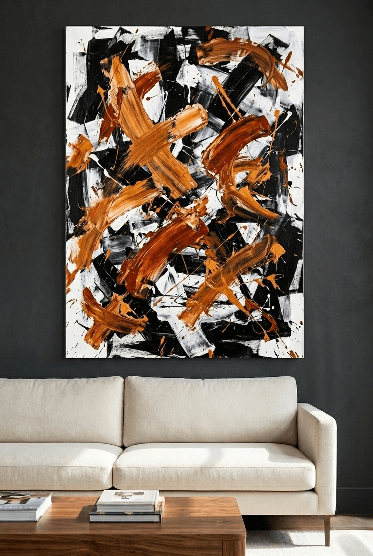
Bold Contrasts: Black and Gold, Red and Black
High-contrast color combinations in wall art create drama and visual impact. These pairings work by juxtaposing opposites: light against dark, warmth against coolness, luxury against edge.
Black and Gold
The black and gold combination has signaled luxury across cultures for centuries. In wall art, this pairing creates a focal point that reads as both modern and timeless. Black provides visual weight while gold introduces warmth and richness.
Best rooms for black and gold wall art: Formal living rooms, dining rooms, entryways, and any space where you want to create a sense of elevated style. This combination works in both traditional and contemporary interiors.
Red and Black
This high-energy combination is bold and unapologetic. Red and black together create visual tension and excitement. In wall art, this pairing works best in spaces designed for activity and engagement rather than relaxation.
Best rooms for red and black wall art: Game rooms, home bars, media rooms, and accent walls in living spaces. Use this combination sparingly to avoid visual fatigue.
Pastels: Soft Pink, Lavender, and Blush
Pastel colors are any hue mixed with white, which reduces their intensity and creates a softer emotional response. Pastel wall art promotes gentle, calming feelings without the coolness that comes with blues and greens.
Pink and Blush
Soft pink has a measurable calming effect. Studies have shown that exposure to pink can temporarily reduce aggressive behavior and lower heart rate. In wall art, blush and rose tones add warmth and softness that makes a room feel nurturing.
Best rooms for pink wall art: Bedrooms, nurseries, reading nooks, and bathrooms. Dusty pink and rose tones work in adult spaces without feeling juvenile.
Lavender and Lilac
Lavender combines the calm of blue with the gentle warmth of red, creating a color associated with relaxation and creativity. It is one of the most versatile pastel options because it reads as both feminine and sophisticated depending on the context.
Best rooms for lavender wall art: Bedrooms, creative spaces, and spa-inspired bathrooms. Lavender pairs beautifully with grey, white, and sage green.
6 Wall Art Picks by Color Mood
Each piece below represents a different color mood for a different purpose. Every canvas arrives framed and ready to hang, printed on premium matte material with free US shipping.

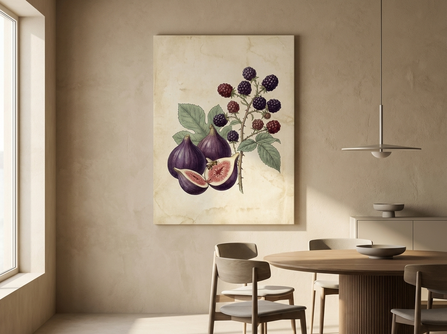
View the Figs and Blackberries

View the Geometric Texture Panels
Room-by-Room Color Guide
Every room has a purpose, and the right wall art color supports that purpose. Here is a quick breakdown of which color families work best in each space.
Bedroom: Cool Blues and Soft Pastels
The bedroom is where your body needs to transition from alertness to sleep. Cool blue wall art lowers psychological arousal and signals rest. Soft pastels in blush, lavender, or sage create a gentle atmosphere that supports relaxation. Avoid bright reds, oranges, and high-contrast combinations that stimulate rather than soothe.
Kitchen and Dining Room: Warm Reds, Oranges, and Earthy Greens
Kitchens benefit from warm colors that create a sense of gathering and shared energy. Burgundy and terracotta wall art near a dining table makes the space feel intimate. Botanical prints with natural greens work near cooking areas, connecting the space to fresh ingredients and nature.
Home Office: Greens and Muted Blues
Productivity research points to green and blue as the best colors for sustained mental work. Green wall art reduces eye strain during long screen sessions, while blue promotes deep focus. Avoid yellow (too stimulating for extended work) and red (too activating for tasks requiring patience).
Living Room: Versatile Neutrals with Color Accents
Living rooms serve multiple functions, from socializing to reading to watching films. Neutral wall art in earth tones provides a flexible foundation, while a single bold piece in teal, gold, or burgundy creates a focal point. The key is balance: one statement piece surrounded by calmer elements.
Bathroom: Cool Tones and Spa-Inspired Palettes
Blue, teal, and soft green wall art transforms a bathroom into a spa-like retreat. These colors mirror water and nature, reinforcing the cleansing purpose of the space. White and grey frames complement bathroom fixtures without competing for attention.
Hallway and Entryway: Warm Welcomes
The entryway is the first impression of your home. Warm neutrals, gold accents, or energetic orange art makes guests feel welcome. Bold black and gold pieces create drama in a narrow hallway where the art can be viewed up close.
Nursery and Kids Room: Pastels and Gentle Brights
Soft colors support developing nervous systems. Pastel wall art in pink, mint, or lavender keeps the room calm during sleep while providing visual interest during play. Avoid oversaturated primary colors, which can be overstimulating for young children.
5 Common Color Mistakes in Wall Art
1. Choosing Art That Matches the Walls Exactly
When wall art blends into the wall color behind it, the piece disappears. Wall art needs contrast to work. If your walls are beige, choose art with rich browns, blues, or greens rather than another shade of beige. The art should stand forward from the wall, not merge with it.
2. Using Too Many Colors in One Room
More than three dominant colors in a single room creates visual chaos. Your wall art should either reinforce colors already present in your furniture and textiles or introduce one new accent color. Five unrelated colors across five different pieces makes a room feel scattered, not curated.
3. Ignoring Undertones
A "grey" wall can lean blue, green, or purple depending on its undertone. If your grey walls have a blue undertone and you choose wall art with warm yellow tones, the clash will feel off even if you cannot immediately identify why. Always compare your wall color and art side by side before committing.
4. Forgetting About Lighting
Colors shift dramatically under different light sources. A canvas that looks vibrant under gallery LED lights may appear muddy under warm incandescent bulbs. Consider the primary light source in the room where the art will hang. North-facing rooms with cool natural light pair well with warm art. South-facing rooms with warm light can handle cooler tones.
5. Playing It Too Safe
A room full of safe, muted tones can feel flat and uninspired. Every space benefits from at least one element that creates visual interest, whether that is a single bold canvas, a contrasting frame color, or a piece with unexpected color combinations. Playing it safe with every choice results in a room that feels like a showroom rather than a home.
Frequently Asked Questions
What color wall art is best for reducing stress?
Blue wall art is the most research-backed choice for stress reduction. Studies show that blue environments lower heart rate and reduce tension. Soft greens and lavender also promote calm. For bedrooms and relaxation spaces, choose art in these cool tones rather than warm reds or bright yellows.
Does wall art color really affect mood?
Yes. Peer-reviewed research spanning over a century confirms that color influences emotional response. A large-scale review of 132 studies found consistent patterns: blue calms, red energizes, green balances, and yellow lifts spirits. Wall art is one of the easiest ways to introduce these color effects into a room without permanent changes like painting.
What color wall art makes a room look bigger?
Cool colors like light blue, teal, and soft green create the illusion of more space because they appear to recede from the viewer. Art with a light background and open composition also helps a room feel larger. Avoid dark, heavy art in small rooms unless you intentionally want a cozy, enclosed feel.
Should wall art match the wall color?
No. Wall art should contrast with the wall color, not match it. If your walls are white or light grey, art with rich colors will pop. If your walls are dark, lighter art creates balance. The goal is for the art to stand forward from the wall as a distinct element. Matching too closely makes the art disappear.
What wall art colors work in a home office?
Green and blue are the best colors for home office wall art. Green reduces eye strain and promotes sustained focus, while blue supports deep concentration. Avoid red (too stimulating for long work sessions) and bright yellow (can cause anxiety over time). Muted teal and sage green are excellent choices that combine focus benefits with visual appeal.
How do I choose wall art colors for an open-plan space?
In open-plan spaces, use a cohesive color palette across all wall art pieces. Choose two or three colors that repeat throughout the space, with each piece emphasizing different proportions of those shared colors. This creates visual flow and connects different zones. For example, a living area might feature a large teal abstract while the adjacent dining area has a botanical print with teal accents.
Quick Reference: Color, Mood, and Room Match
| Color Family | Mood Effect | Best Rooms | Our Pick |
|---|---|---|---|
| Blue and Navy | Calm, focus, trust | Bedroom, office, bathroom | Iceberg of Success |
| Red and Burgundy | Energy, warmth, appetite | Dining room, entryway, living room | Figs and Blackberries |
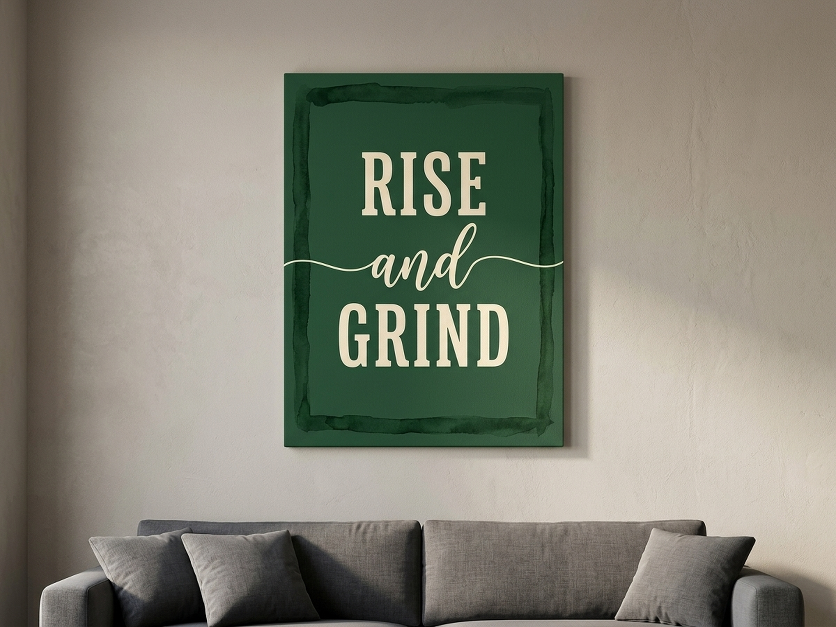
| Green and Sage | Balance, renewal, focus | Office, living room, bedroom | Rise and Grind |
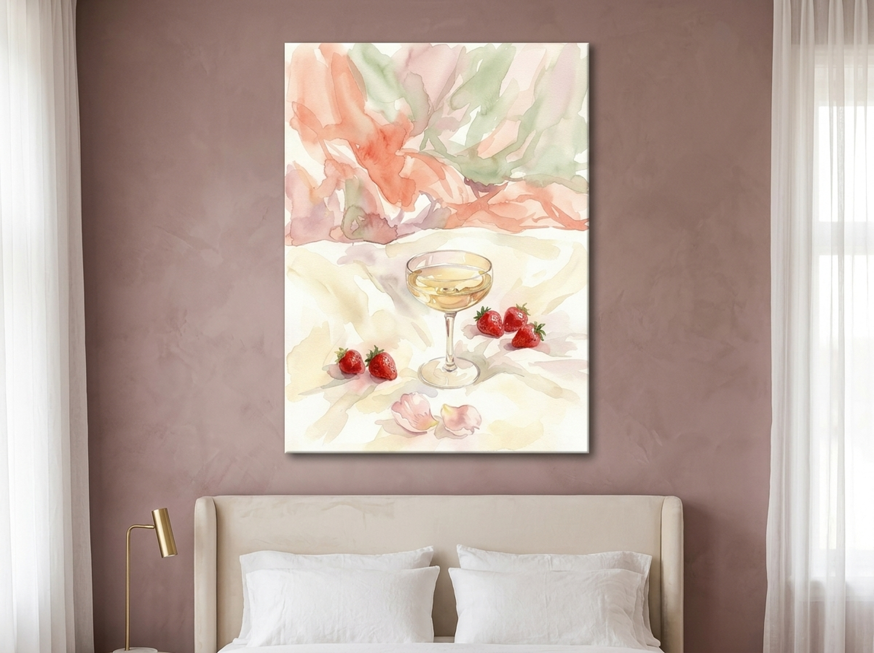
| Pink and Blush | Nurturing, gentle calm | Bedroom, nursery, reading nook | Champagne Strawberry |
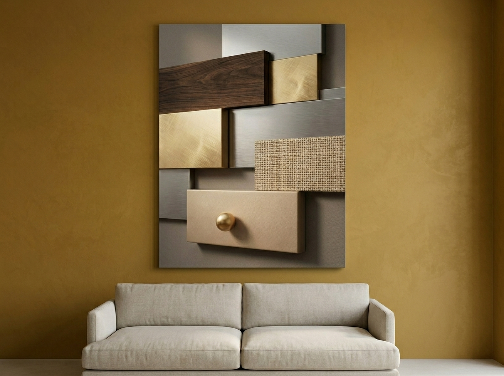
| Earth Tones | Stability, warmth, grounding | Hallway, den, living room | Geometric Texture Panels |
| Orange and Amber | Social energy, enthusiasm | Kitchen, family room, media room | Volcano |
Find Your Perfect Color Mood
Every piece in our collection is a gallery-quality framed canvas print that arrives ready to hang. Free US shipping on all orders.