Spring Wall Art Ideas for Living Room and Bedroom
The Heva Team
Art Curators & Interior Design Enthusiasts · March 11, 2026 · 10 min read
Bring the beauty of spring indoors with floral and botanical canvas wall art that refreshes any room.
Every spring, the same impulse hits: open the windows, clear the clutter, and make the house feel alive again. Fresh flowers on the table help, but they wilt by Thursday. The walls, though, are where a seasonal refresh actually sticks. The right canvas print can shift a room from winter-heavy to spring-light in the time it takes to hang a single nail. This guide gives you specific pieces, placement measurements, and colour coordination advice so your spring wall art does more than just look pretty. It makes the room feel like a different season.
Ready to browse? Shop the Spring Collection or keep reading for our top picks and expert tips.
Why Swapping Wall Art for Spring Actually Works
Seasonal decoration is not just an aesthetic habit. Research in environmental psychology shows that visual cues in your environment influence mood, energy, and even cognitive performance. A 2019 study published in Frontiers in Psychology found that exposure to nature imagery, even in the form of wall art, reduced cortisol levels by up to 15 percent compared to abstract or urban imagery. Spring-themed wall art taps into this effect by introducing natural elements, soft light, and organic colour palettes that signal renewal to your brain.
The practical benefit is equally straightforward. Swapping a single large canvas above your sofa takes under five minutes. There are no paint fumes, no furniture to move, no contractor to schedule. A 24 by 32 inch (61 by 81 cm) canvas print is the most versatile size for this purpose. It fits above a standard 72-inch sofa with room to spare, and the pinewood frame options (black, white, espresso, or natural) let you match any existing decor without committing to a permanent change.
If you already rotate throw pillows or table runners with the seasons, wall art is the logical next step. The visual payoff per minute of effort is unmatched. One well-chosen canvas print anchors an entire room's mood.
Spring Colour Palettes That Interior Designers Reach For First
Not every pastel qualifies as spring. The palettes that actually work in interior spaces are more nuanced than a generic pink-and-green combination. Here are the three colour families that professional designers use most for spring refreshes:
Soft Meadow: Lavender, Sage, and Warm Gold
This palette mirrors the colour of a wildflower field at golden hour. Lavender provides a cool anchor, sage green adds organic warmth, and touches of gold (in frame hardware or a painted sky) lift the composition. This palette works best in bedrooms and reading nooks where you want calm energy without feeling cold. It pairs well with minimalist furniture in light oak or white finishes.
Botanical Fresh: Emerald, Cream, and Coral
Deeper greens signal growth and vitality. When paired with cream backgrounds and coral accents, the result feels lush without being heavy. This palette suits dining rooms, sunrooms, and open-plan living areas where natural light can play off the green tones. The key is to let the emerald dominate and use coral sparingly, usually in a single floral element or brushstroke.
Sunrise Warm: Amber, Blush, and Soft Blue-Grey
This palette captures the first fifteen minutes of a spring morning. Amber and blush carry warmth while blue-grey keeps the composition grounded. It works exceptionally well in hallways and entryways where you want visitors to feel welcomed immediately. Art featuring landscapes, rolling hills, or morning mist uses this palette naturally.
6 Canvas Prints That Bring Spring Indoors
1. Wildflower Meadow Canvas Wall Art
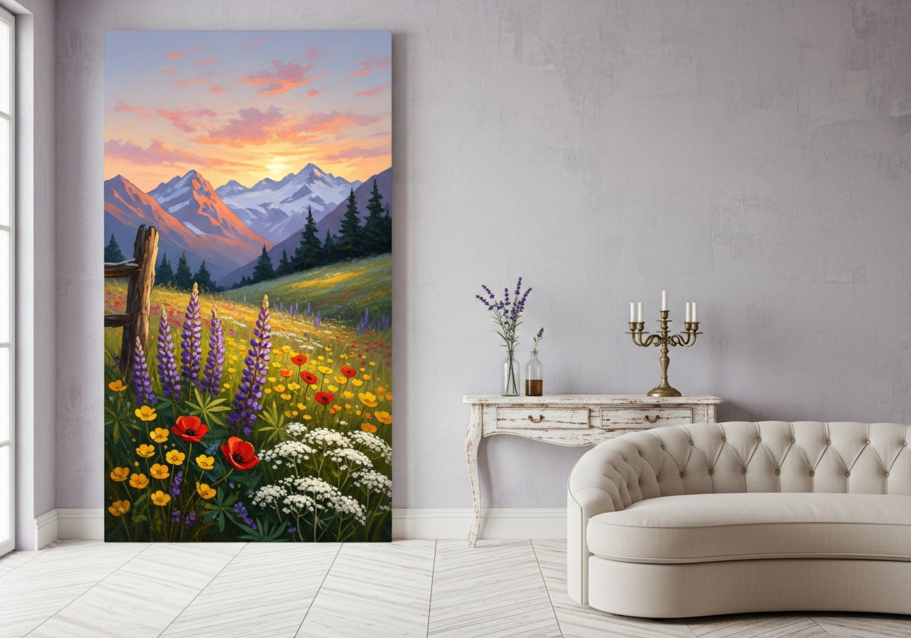
This mountain landscape oil painting captures a vast meadow of wildflowers in lavender, gold, and sage green with distant peaks fading into a soft blue sky. The impressionist brushwork gives it the feel of a plein air painting discovered in a European gallery. It is the anchor piece for a spring bedroom refresh: hang it centred above the headboard at 15 to 20 cm (6 to 8 inches) above the top of the frame. The warm gold tones pick up brass bedside lamps or gold-framed mirrors beautifully.
View the Wildflower Meadow Canvas Wall Art
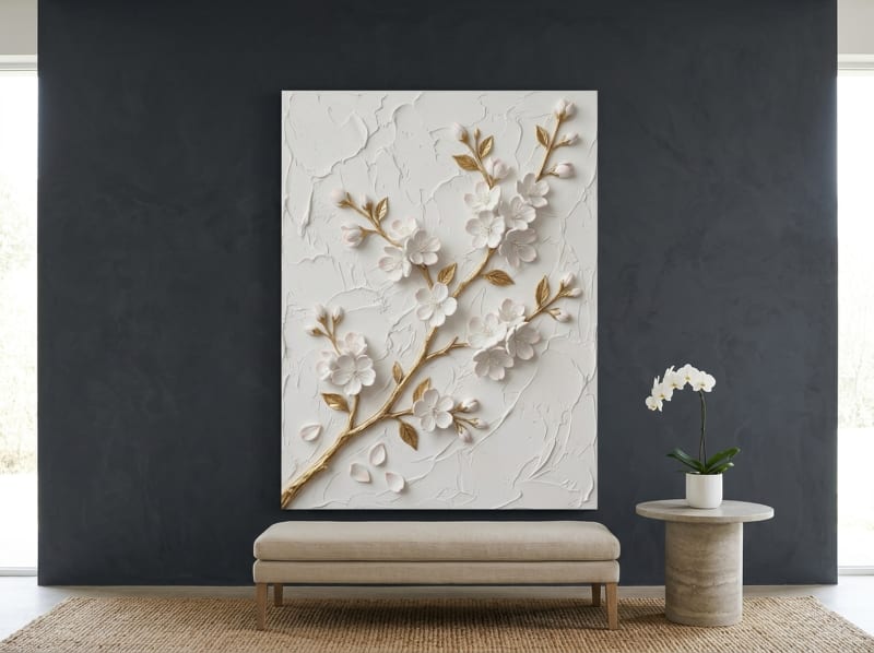
2. Cherry Blossom Canvas Wall Art
A sculptural relief effect in white and gold with delicate pink cherry blossoms branching across the composition. The raised texture look makes this piece feel more like a dimensional artwork than a flat print. It is at its best in a hallway or narrow wall where its vertical format draws the eye upward, making low ceilings feel taller. Pair it with a simple white or natural wood frame to let the sculptural detail speak.
View the Cherry Blossom Canvas Wall Art
3. Hummingbird Watercolor Canvas Wall Art
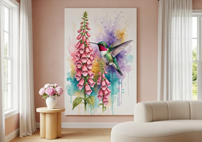
A ruby-throated hummingbird hovering among foxglove flowers in emerald green and coral tones. The watercolour style keeps the piece light and airy, which is exactly what spring decor should feel like. This canvas works brilliantly in a sunroom or dining room where natural light brings out the transparency of the watercolour washes. At 24 by 32 inches (61 by 81 cm), it fills a wall space without overwhelming a small room.
View the Hummingbird Watercolor Canvas Wall Art
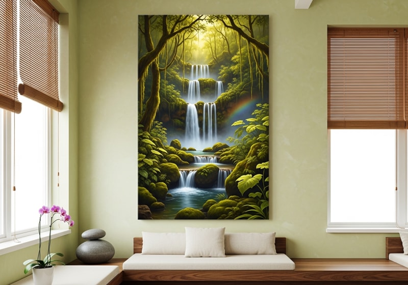
4. Waterfall Canvas Wall Art
A tropical forest waterfall painted in lush emerald greens and misty blues with white water cascading through layers of rock and fern. This piece brings a sense of motion and sound to any room. It is a strong pick for bathrooms, where the water theme is literal, but it also works in living rooms as a conversation piece. The deep greens pair with rattan, wicker, and light wood furniture that many people bring out for spring and summer.
View the Waterfall Canvas Wall Art
5. Highland Cow Canvas Wall Art
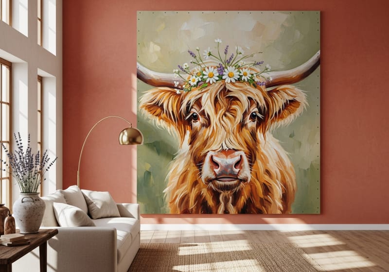
An impressionist oil painting of a fluffy highland cow in warm honey amber and sage green tones. The loose brushwork and warm palette give this piece a cosy, pastoral quality that suits farmhouse and country-inspired spaces. Hang it in the living room or kitchen above a console table with a small vase of fresh wildflowers underneath for the full spring farmhouse effect. The natural wood frame option enhances the rustic mood.
View the Highland Cow Canvas Wall Art
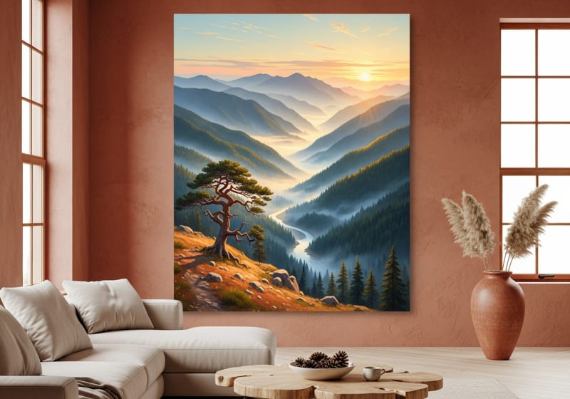
6. Misty Mountain Valley Canvas Wall Art
A sunrise landscape with rolling fog drifting over a forested valley in amber, forest green, and blue-grey. This piece feels like waking up in a cabin with the windows open. It is best suited for bedrooms and studies where you want a calming, contemplative atmosphere. The amber sunrise warmth keeps it from feeling cold or moody, making it a genuine spring piece rather than an autumn one.
View the Misty Mountain Valley Canvas Wall Art
Where to Hang Spring Art for the Biggest Impact
Placement determines whether a new canvas feels intentional or like an afterthought. These measurements come from gallery hanging standards adapted for residential spaces:
Above the Sofa
The centre of the canvas should sit at 145 to 150 cm (57 to 60 inches) from the floor, which is standard museum eye height. Leave 15 to 20 cm (6 to 8 inches) between the top of the sofa and the bottom edge of the frame. The canvas width should be roughly 60 to 75 percent of the sofa width. For a 200 cm (80-inch) sofa, a 24 by 32 inch canvas works alone or as part of a pair.
In the Hallway or Entryway
Hallways benefit from vertical-format art. A portrait-oriented 24 by 32 inch canvas at eye height (centre at 150 cm / 60 inches) creates a focal point that draws guests inward. In narrow hallways under 120 cm (48 inches) wide, keep frames thin and wall colours light to avoid a boxed-in feeling. Spring florals and botanical prints work especially well here because they create a sense of arrival.
Above the Bed
Centre the canvas above the headboard with 15 to 25 cm (6 to 10 inches) of space between. If your headboard is tall (over 120 cm / 48 inches), go with a wider horizontal piece. For standard headboards, a single 24 by 32 canvas centred is the cleanest look. Avoid hanging anything heavy directly over your pillow area. Canvas prints on pinewood frames are lightweight (typically under 2 kg / 4.5 lbs for a 24 by 32) and secure with a single nail.
Bathroom
Canvas prints work in bathrooms as long as they are not directly above a shower or in a steam zone. A well-ventilated bathroom with an exhaust fan is fine. Hang the piece on the wall opposite the mirror for a reflected double impact, or above the toilet where it catches the eye at entrance. Our canvas prints use archival inks that resist moisture in normal bathroom conditions.
Common Mistakes With Seasonal Wall Art
1. Going Too Literal With the Season
You do not need a canvas that says "Welcome Spring" in cursive. The most effective seasonal art uses colour and subject matter to evoke the season without spelling it out. A wildflower meadow reads as spring without being kitschy. A canvas with the word "SPRING" printed on it will feel dated by May.
2. Hanging Too Small
A 20 by 30 cm (8 by 12 inch) print above a large sofa looks like a postage stamp. Match the scale of the art to the wall and the furniture below it. When in doubt, go larger. A single 24 by 32 inch canvas has more impact than three small prints scattered across the same wall.
3. Ignoring Frame Colour
The frame is part of the composition. A black frame on a pale floral print adds contrast and modernity. A natural wood frame on the same print feels farmhouse. Choose the frame colour based on the other hardware in the room: door handles, light fixtures, and furniture legs. Matching metals to frame colour creates visual cohesion.
4. Forgetting Lighting
Wall art looks flat under overhead fluorescent light and stunning under warm directional light. A simple picture light or an angled floor lamp pointed at the canvas transforms how the colours read. Spring palettes especially benefit from warm white light (2700K to 3000K) which brings out golds, blushes, and greens. Read our guide to lighting wall art like a gallery for detailed setup instructions.
5. Leaving Winter Art Up Until June
If you committed to a moody, dark-toned piece in November, swap it out by mid-March. The psychological benefit of seasonal art comes from the change itself. Your brain registers the new visual, associates it with the new season, and shifts mood accordingly. Leaving a dark forest scene up through spring flattens this effect entirely.
Frequently Asked Questions
What colours work best for spring wall art?
Soft lavender, sage green, warm gold, emerald, coral, blush pink, and light blue-grey are the most effective spring colours for wall art. Avoid neon brights or stark whites, which feel clinical rather than seasonal. The most versatile spring art combines two or three of these tones in a naturalistic composition like a wildflower meadow, botanical print, or sunrise landscape.
Can I use the same wall art year-round or should I rotate seasonally?
Both approaches work. Nature-inspired art in neutral-warm palettes (greens, ambers, creams) reads well in every season. If you prefer seasonal rotation, keep two or three canvas prints and swap them with the seasons. Store off-season canvases in a closet with a soft cloth over the face to prevent dust. The swap takes under five minutes per piece.
What size canvas print works best for a spring refresh?
A 24 by 32 inch (61 by 81 cm) canvas is the sweet spot for most rooms. It is large enough to serve as a focal point above a sofa or bed, but compact enough to hang in a hallway or bathroom. For large walls over 300 cm (120 inches) wide, consider a 30 by 40 or 40 by 60 inch canvas, or a pair of complementary pieces hung 5 to 8 cm (2 to 3 inches) apart.
Do floral prints look dated quickly?
Generic floral patterns from fast-decor retailers can feel trendy and disposable. Art-quality florals, those painted in oil, watercolour, or impressionist styles with visible brushwork and thoughtful composition, age as well as any landscape or portrait. The key is choosing florals that look like paintings rather than wallpaper patterns. A single botanical canvas with artistic depth will look as good in five years as it does today.
How do I coordinate spring wall art with existing furniture?
Pull one accent colour from the art and echo it in a throw pillow, vase, or table runner. This creates intentional connection without being too matchy. For example, if your canvas has coral accents, add a single coral cushion to the sofa. Avoid matching more than two elements to the art or the room starts to feel staged. Read our guide to matching wall art with furniture for more specific pairing advice.
Do your canvas prints come framed and ready to hang?
Yes. Every canvas print ships in a sturdy pinewood frame with pre-installed hanging hardware. Choose from four frame colours: black, white, espresso, or natural wood. The canvas is printed on premium matte cotton-poly blend and arrives ready to hang straight out of the box.
Quick Reference: Spring Canvas Picks at a Glance
| Product | Best For | Dominant Colours | Link |
|---|---|---|---|
| Wildflower Meadow | Bedrooms, living rooms | Lavender, gold, sage | View |
| Cherry Blossom | Hallways, bedrooms | White, gold, soft pink | View |
| Hummingbird Watercolor | Sunrooms, dining rooms | Emerald, coral, cream | View |
| Waterfall | Bathrooms, living rooms | Emerald, misty blue | View |
| Highland Cow | Farmhouse living, kitchen | Honey amber, sage | View |
| Misty Mountain Valley | Bedrooms, studies | Amber, green, blue-grey | View |
Spring is the easiest season to redecorate for because the palette is forgiving and the mood is universally welcome. A single well-chosen canvas print above the sofa, in the hallway, or over the bed can shift an entire room's energy from winter-heavy to spring-light in under five minutes. Browse the full Spring Collection to find the piece that fits your space.